
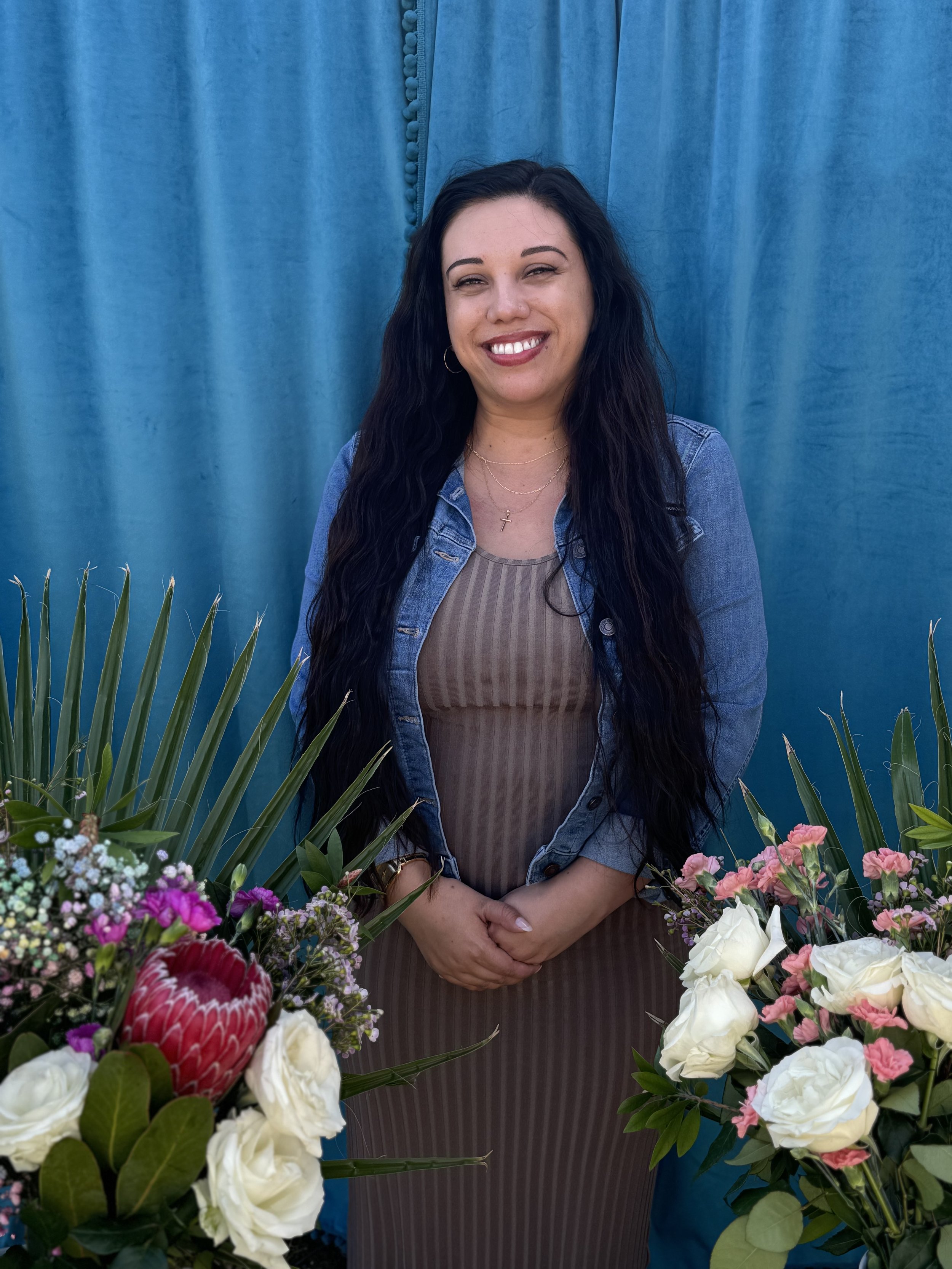
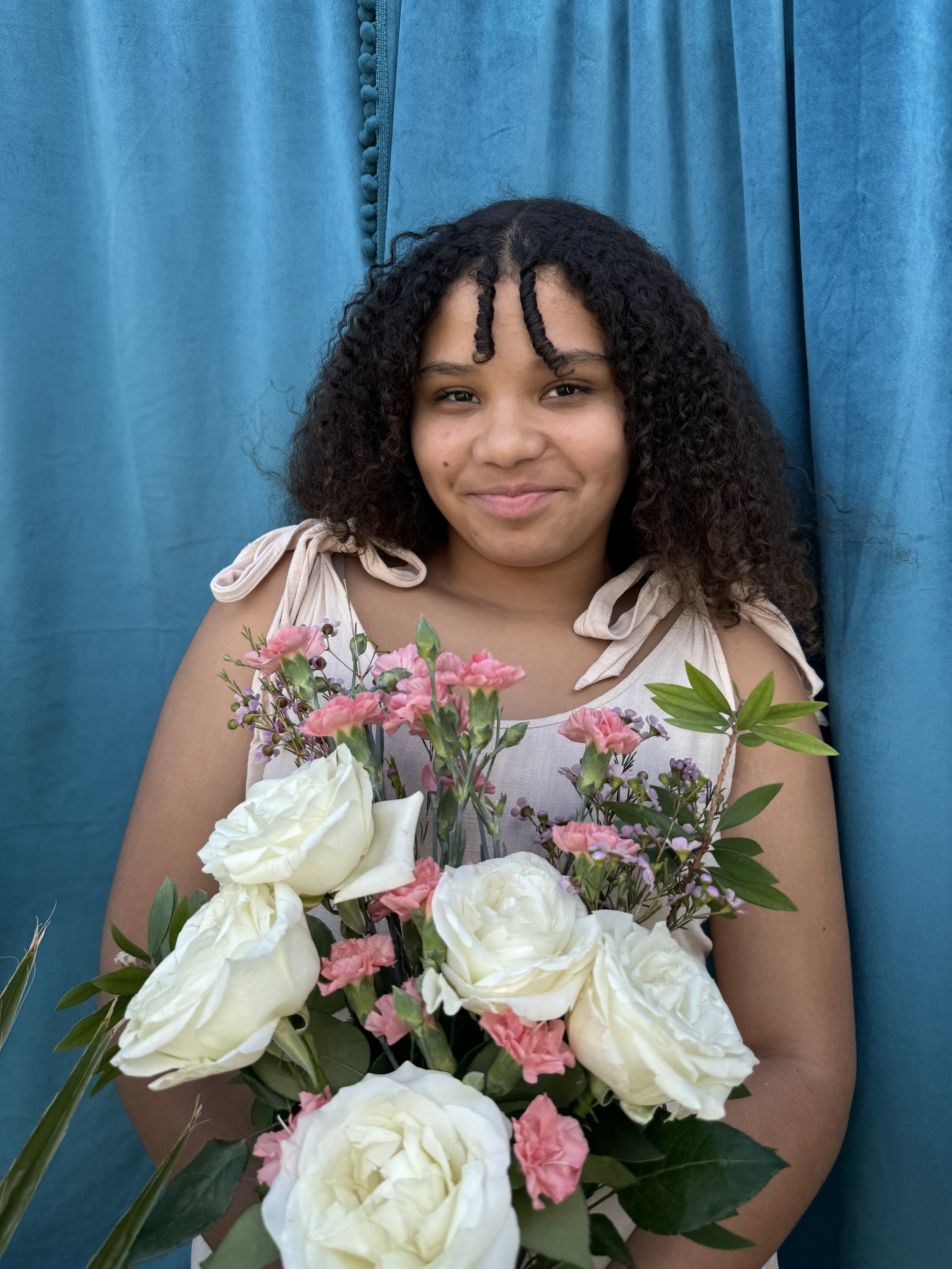
Mujeres
Family portraits from Mother’s Day
-

Doña Marta (Inocencia Chavez)
Born 1940, Daughter of Marcel and Cerilla Chvez
-

Maria Short AKA "La Chona"
Born 1956
-

Shannon Doronio Chavez
Born 1980
-

Christina Marie Colbert
Born 1985
-
Brandee Klock
Born 1988
-

Kimberly Klock
Born 1993
-
Aria Colbert
Born 2012
-

Autumn "Rosy" Epstein
Born 2013
-

Sofia Doronio
Born 2014

This portrait of Big Nana is a prized possession within the Chavez family. My Great Grandpa Marcel had this portrait painted of his wife whom he loved so dearly. She is regal, her strength and resilience is palpable. She sits strong and confident with her pearls and beaded earrings reflecting the two worlds she lived in as an indigenous Mexican woman, married to a well-to-do working-class Meztiso man. For mother’s day I wanted to make portraits of all the mujeres in our family to show all of them as strong and as resilient as she was. I am in the process of retouching these images and plan to have them printed and framed and returned to each woman.
I COULD NOT GET NANA TO TAKE HER SUNNIES OFF. :P
RISO PRINTING ZINES
I love that I have access to this RISO EZ 221 at my place of work. I have adopted this little chica as my own—but she is a fickle-ass-betch. I have access to 6 color drums, and on this day after running off 300 sheets the red ink drum became clogged. This is my first attempt at printing a 2-color 16 page zine, and until I get the drum clean I am stuck with a half-finished project. My other option is to run the rest of the color illustrations in Blue or Teal. But I really had my heart set on RED.
Packet 4
〰️
Packet 4 〰️
Pin Up Plan

Imago DEIsign
Imago DEIsign
I created a wireframe for the Imago DEIsign box and started laying out content for this project. I think may have found my thesis project here.
GOOPING
Psalms For Las Chingonas
The illustrations, and layout for this Zine are complete and it is headed to the RISO for production. I’m super excited to hand these out in CO. I also plan to take a handful to Tia Chuchas Books & Zines here in the SFV. You can flip through below for a preview.
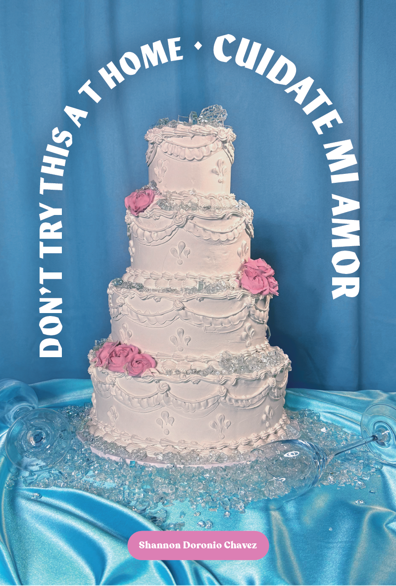
As I prepare to reoshoot my Gooping images to make the series more cohesive, I decided to try froming a cake Arch for Sin Vegruenza. This time I tried to do it myself, previous cakes were made with a professional cake decorator. My goal was to explore feelings of “authorship” in works made with and without a fabricator. What I learned was that I like working with a fabricator better. I spent about half as much money but this beast cost me a lot of time, quality and agony.
Left is my first attempt which went in the trash, right is the second attempt which might be passable with some photo shop love.


In post, pump up the safety glass “green”
Aged and wilted wedding bouquet tells the story of inevitable revelation of our personal natures
that are revealed in marital relationships.

Quick photo test. Color are blown out here. I’ll be adding faux frosting flowers to mask areas of “low craft.”
When I finished the Quinceañera piece I realized that there were opportunities to add levels of meaning to the previous images. Specifically with the weddig cake which I had previiously mentioned felt was missing something, and I was wary of turning it into a “broken marriage” trope as that is not the whole story of the work.
My Packet 3 convo with Yoon Soo helped me solve the communication problem.
My Aphantasia prevents me from being able to imagine images in great detail in order to “prove concept.” My adaptation shows up in my process as deep iteration. I have to “see it” to analyze it, this takes an agaonizing amount of time.
With new AI tools, I can quickly mock-up an idea fast enough to see it, test it and adjust. I can move into setting up a shoot with greater confidence and less need for labor intensive “real life revision.” The image below was mocked up using Adobe Photoshop AI tools.

Hands cutting into the cake tell the story of “choosing” your marriage even when
it isn’t perfect.
On set: place hands higher, at a downward angle, add frosting to the knife.
ALL THE FEELZ
I have 2 new spreads completed for “All the Feelz.” It was so satisfying to bring the spanish word GANAS into cannon of feelings. I’ve reached out to a couple of friends who come from other cultures, and have other words and emotional concepts that my not have direct english translations to see if they would like to contribute a word. If this thing ever gets picked up for publishing the plan is to profit share with those contributors.
As I have evolved as a designer/ thinker/ educator/ mother I’ve picked up additional goals for this project. This process has transformed this project into an illustrated answer for a question I have been asking since I was a first-year undergrad. How can we build processes for design that consider multiple bottom-lines? How do we do more than create another thing?
The goal for this project originally was to create a resource that I feel has been missing as I teach my kids about their emotional worlds.
The bottom line goals for All the Feelz are:
1) to create a learning resource for children and parents, and adults reparenting their own inner child that increases emotional vocabulary.
2) to increase representation across multiple demographic groups that are massively underrepresented in children’s publishing.
3) to fulfill my own egoic bucket-list goal of entering the cannon of graphic designers who design A-Z children’s books (see Milton Glaser, Bruno Munari).


Packet No. 3
Packet No. 3
feliz quince años
feliz quince años


Ella Habla Mucho
With the explorations of creating this image, I have found a better typographic solution for a multilingual book title. I see that I am building and documenting altars to experience. I have also seen greater opportunities for expanding the worlds in each altar. Tienes Sin Verguenza is going to need a re-shoot to accommodate the typographic treatment. Don’t Try This at home requires one more level of storytelling and I am not sure what is missing or what that is yet. I don’t want to hit any “broken marriage” tropes too hard. The starting point for this concept was that in our worst moments, we remember the flavor of our wedding cake better than we remember the vows—which if you spoke the classic “til death do us part” —were filled with all the warning signs of a long term relationship. There will be good times, bad, sickness, health etc. I wanted to merge the havoc with the cake as a totem/ altar that reflects the actual experience of marriage. I'm thinking on this one.


Songs To Know
& Sing By Heart.
I started making pages of song lyrics inspired by “prayer cards” in my memoir chapbooks last semester. I felt the pages had more potential to communicate the idea of a song being a spiritual touchstone, a salve for the ails and growing pains of being a woman. I decided to invest in elevating the design with some bespoke illustrations that connect to the message/concept that each song holds/ or has held for me. There are times when a traditional prayer has been what I needed, and there are an equal amount of times when a woman yelling over some gogo drums, or delivering a witty set of bars is just as powerful. Celebrating these songs with a nod to the visual language of catholic prayer cards is also a fun way to return value and power to the divine wisdom of the feminine.
There is also a Spotify playlist for this project: Psalms For Las Chingonas


Photo Sketches
I’m testing a new photo setup in my home, with some new props and visual concepts. These photo sketches help me think and compose better when I am ready to shoot final images. They also help me understand how color can be pumped up in editing.


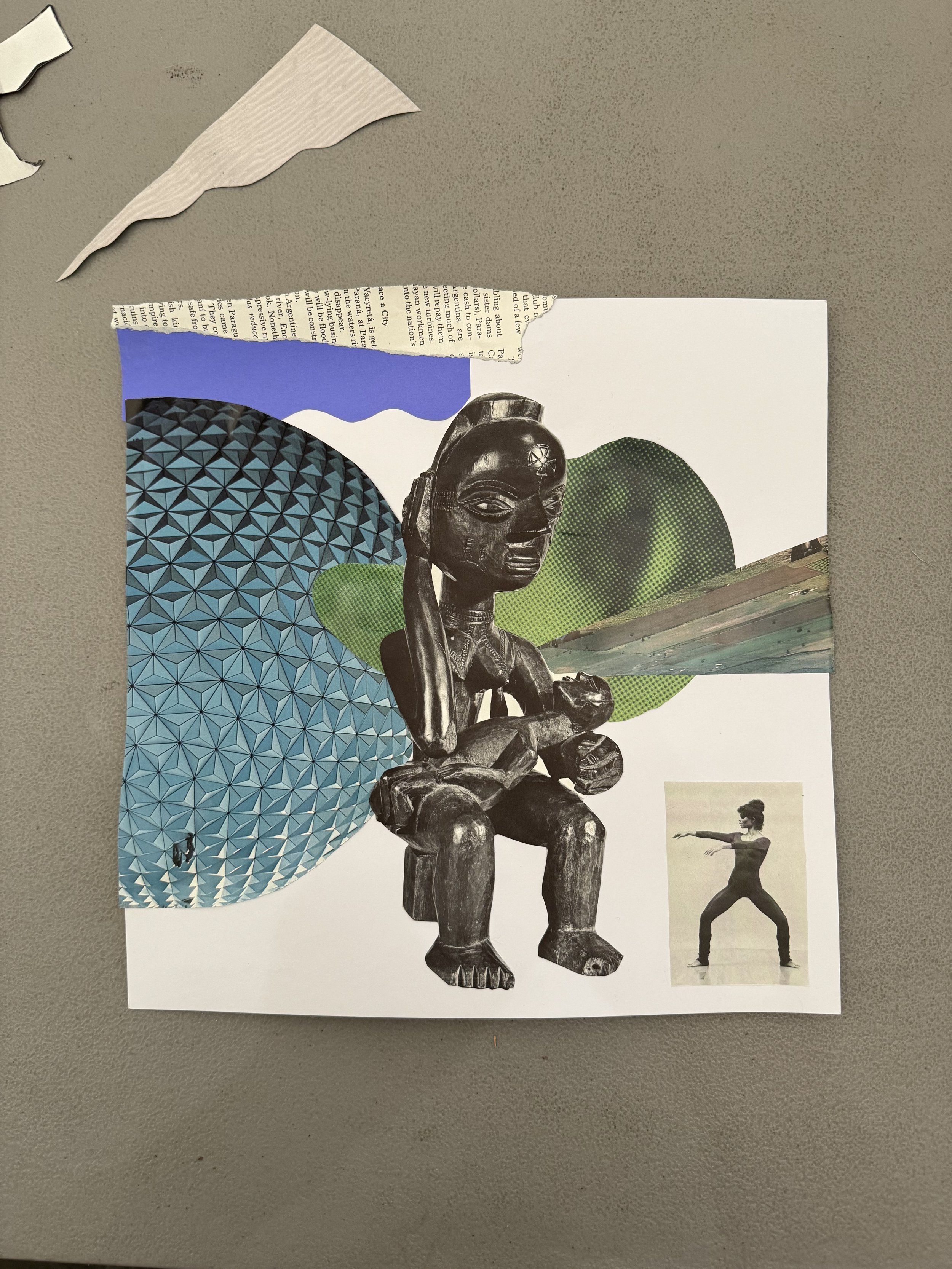
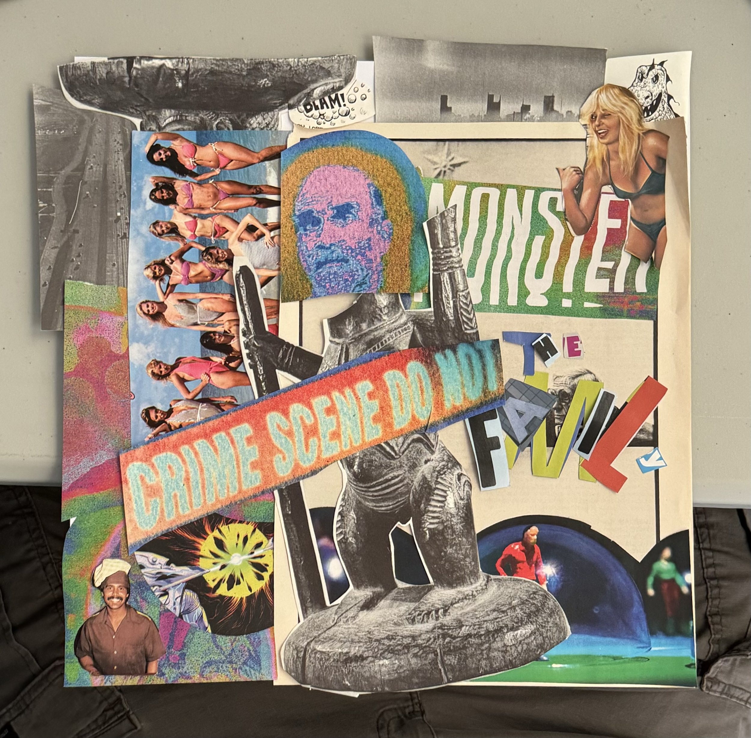
Dewey Saunders Collage Workshop
On March 14th, the Graphic & Multimedia Design department hosted a lecture and workshop led by Dewey Saunders. Dewey shared the entire design process behind his treatment of Anderson .Paak’s Malibu album which included all of the singles and tour poster. He spoke candidly about the hustle that exists in the gap between being a design student and establishing a solid career as a full-time designer.
In the workshop, we provided participants with 12 x 12” cardstock and a pile of expertly curated books and magazines to cannibalize into collaged album covers.
My Collage
Record
This Woman’s Work - Covered by Maxwell
Thoughts
I approached my collage like I would a tarot deck, or when practicing bibliomancy. I let my subconscious do the picking based on guttural response. The first image I spotted was this African statue of a mother and child. I was instantly reminded of the “La Pieta” statue in my childhood home.

Student Work


PACKET No. 2
PACKET No. 2
Hypothetical Book Covers

Is this a cult or a college
textbook from 1999?

This approach was inspired by the Bauhaus Under the Bus process. The object I started with was a plastic woven market tote, familiar to Latiné shoppers.

Imago DEIsign Tarot

Format Idea
I’m considering formatting Imago DEIsign in the shape of a Tarot Deck.
This format is less intimidating than a book and more playful. It invites curious and passionate educators to draw just a few cards to implement at a time—making the revolutionary act of redesigning how we teach and why, into a stackable adventure.
The deck of cards provides exercises, tools, and to-dos gathered from my practice and contributors who are also design educators exploring ways to change how we teach.
The companion booklet connects cards to essays, advice, and case studies from contributors.
3.9.24
Radical Critique Lexicon (SCD)
+
Functional Criticism (YSL)
My Type & Typography students are engaging in their first critique of finished work. The follwing objectives are outlined in the assignment document. Students used these objectives as a starting point for “Mountains, Leaves and Trees,” then they began to include their own personal learning objectives. One of the things I loved about this tool was that it helped us get past the obvious aspects of critique and into the deeper conversations quickly!
Practical Objectives
Join two letterforms together to create a true ligature
Become more familiar with the anatomic aspects of letterforms
See letterforms as shapes with positive and negative space
Appreciate the hand skills required to be a professional designer before 1984

Cultural Objectives
Express personal aesthetic taste through the mark to begin forming connections between your design and the story you want to share
Appreciate the work of your fellow design students, be curious about how they arrived at their solution


Design Ed Hospitality
Inspired by the concept of hospitality as a means of reducing anxiety, I created a zine appreciation, and collage space outside of our learning lab. My hope was that students would sit down and read, draw, and make collages.
The results have been great, the wall is filled up.
Hooray for doing things in real life. :)


Revised drawing uses more color


Color mixing

The crinolina is finished with pearls, a prized item in Aztec culture, and later the greatest export from Mexico to Spain.
¡Feliz Cumpleaños!


Frosting embellishments are added in pink, white, blue and yellow.
Crinolina base is “Jade” in honor of Chalciuhtlicue (She with the Jade Skirt)
La Barbie Cake

Xōchiquetzal and Chalciuhtlicue referenced in gold plates, feathers, and Turquoise - Glamor and Fertility
Packet No.1
Packet No.1
Nonsense
a) words or language having no meaning or conveying no intelligible ideas.
b) language, conduct, or an idea that is absurd or contrary to good sense.
c) an instance of absurd action.
d) things of no importance or value: trifles
e) affected or impudent conduct
f) genetic information consisting of one or more codons that do not code for any amino acid and usually cause termination of the molecular chain in protein synthesis (see SYNTHESIS sense 1)


Indigenous Otomi embroidery technique using the typeface Mixta designed by Rodrigo Fuenzalida.
Iteration 2 (see og here)
BEST IN FULL SCREEN MODE
BEST IN FULL SCREEN MODE


Bauhaus Debajo El Autobús
Workshop with Silas Munro and Ramon Tejada
90 minutes • 1 object • 25 2-D images, 1 3-D image, and 1 4-D image.
Music - UFO by ESG
Eff Them Kids
(Elana Schlenker Meme workshop)
When they got Nike, and you’re proud of your Payless.
When daddy bought them a Beamer, and your bucket got paint chipped.
When that lady is telling you how to raise your kids, like she does hers. (Dottie)
When you’re trying to talk about Type, and they’re surfing Reddit in your face!
When everyone is an expat, with a painting easel at 8AM. (Ramon)
When you wanna dance to De La Soul, but they picked Paula Abdul.
When they call you m’am and it’s too soon.
When they say why vote, the candidates are all the same.
When they don’t wanna pay for fonts!

Running with the devil.

I found an AI meme generator and fed it this image of my dying plant. It was exactly what you would expect of AI, it delivered the mean
or average of what it’s training calls ‘funny.’

Then out of curiosity, I started feeding it images I made in GD1, starting with this wedding cake image that serves as an illustration for writings on infidelity and marital collapse. This time the result was dark and weird, and oddly on theme with that “Lemonaide (Beyonce)” reference.

When I fed it the image of my flower altar it started to get sassy though, instead of delivering a mean of what is funny, it just GOT MEAN.
LA BARBIE CAKE
This mood board is the beginning of pulling together semiotics for a third “self-portrait”
The story is based on the tradition of the Quinceanera, a Mexica ritual in which the celebrant is publicly transitioning from girl to woman, and entering society as a potential bride. In the 1500s the Spaniards “civilized” this ritual, dressing it up in a colonial veneer of petticoats/crinolinas. Today, giant crinolinas of all colors are still the preferred Quinceanera attire.
The cake is an obvious semiotic for a birthday, but the Barbie cake specifically puts a fine edge on the tension between girl and woman—opening up a discussion about gender, beauty standards, colonialism, indigeneity, and patriarchy. The total image holds the complexities of being a girl of a certain age—living in a body that still wants to play and indulge like a child—while the world outside anxiously waits to consume her.
The Barbie I plan to use in this piece is one I recently purchased from eBay, and is the exact doll I had as a 4-year-old little girl. She was the first doll that was handed to me that was not white, with blonde hair and blue eyes. That doll did something to me, made me feel like I was REAL.
There is a family story about Crinolinas that I plan to write for packet #2.

CAKE
I was curious to see what “trend” would emerge as I moved into expanding my self-portraits into a series. What would be the unifying elements? Some things were obvious - it needs to be photographic, monochromatic, and object-based. With the possibility of the Barbie Cake on the table it looks like CAKE is also something my subconscious mind is serving, which is funny because two of my undergrad projects were also delivered in the form of Cake.
“POTENTIAL” [CODESWITCH]
Time-based digital collage using animated gifs, and sound.
Aesthetic inspiration - Family Ties video by Baby Keem & Kendrick Lamar


Sketch & Assets for video generated in Adobe Illustrator
Animation produced with After Effects
Sound edited in Audition


