
Imago DEIsign
(book) v2
I am compiling writings into front matter, Essays, and Assignments into the Imago DEIsign book. This is my first pass at a solid design structure for each content type, with a system of typographic hierarchy applied (this has not been proofed for orphans, widows, stacks, etc.) I’m imagining this as a box with a series of stapled zines, and cards. This format encourages agency, reduces overwhelm, can be easily scanned or photo-copied, shared, and references the laboratory practices of Zine Culture.
The new cover has been updated to balance out color, the subtitle has been improved, and the compositional changes are driven by concepts or layering, poking through, seeing in reverse, and softening.

The first iteration of the cover was inspired by insights from the Bauhaus Under the Bus workshop and David Batchelor’s Chromophobia. Batchelor critiques the so-called “utilitarian” aesthetic, revealing it as a Eurocentric minimalism rooted in xenophobia. His thesis takes shape against the backdrop of a high-society dinner party held in an extravagant, colorless home stripped of any cultural nuance—a setting that reflects the very ideas he challenges. :)
I wandered through my house, eyeing my familiar, utilitarian objects, and imagined which one would most horrify that dinner party host as a "gift.” My eyes landed on my grocery tote sitting by my front door— a sturdy, brightly colored bag made from recycled plastic bottles. Its reusability helps me reduce plastic waste, and its vibrant color sparks joy every time I use it. It is an item that has been familiar since my early childhood visiting Big Nana in National city and going grocery shopping with my dad so she could make menudo and tacos for the family.


Faculty Lounge,
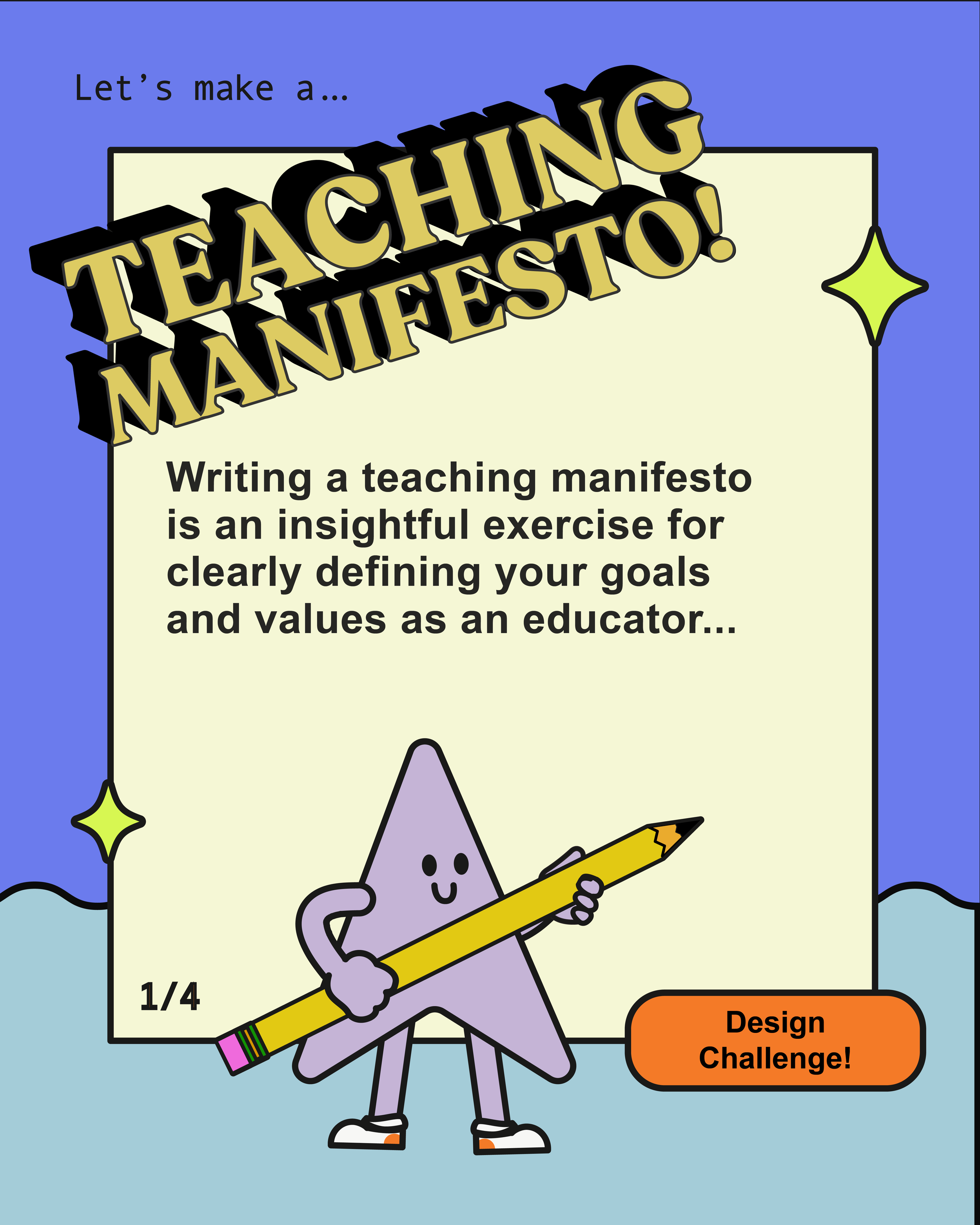
Imago DEIsign Manifesto, & Substack
Attendance at the November Faculty Lounge hovered around 8–10 participants, rotating in and out during the 90-minute session. I opened with a group question on critique practices, and soon after, discussions expanded to navigating student use of AI and handling confrontational, disruptive, or entitled student behaviors.
The session ran overtime as we delved into issues around managing student conduct, a reminder of how misguided the assumed equivalence of design practice and design teaching can be. Teaching design requires distinct skills beyond those of design practitioners—especially training in classroom management, pedagogy, and student engagement. This need is particularly pressing in the arts, where creative expression meets diverse student personalities and learning styles, demanding an informed and responsive approach from educators.


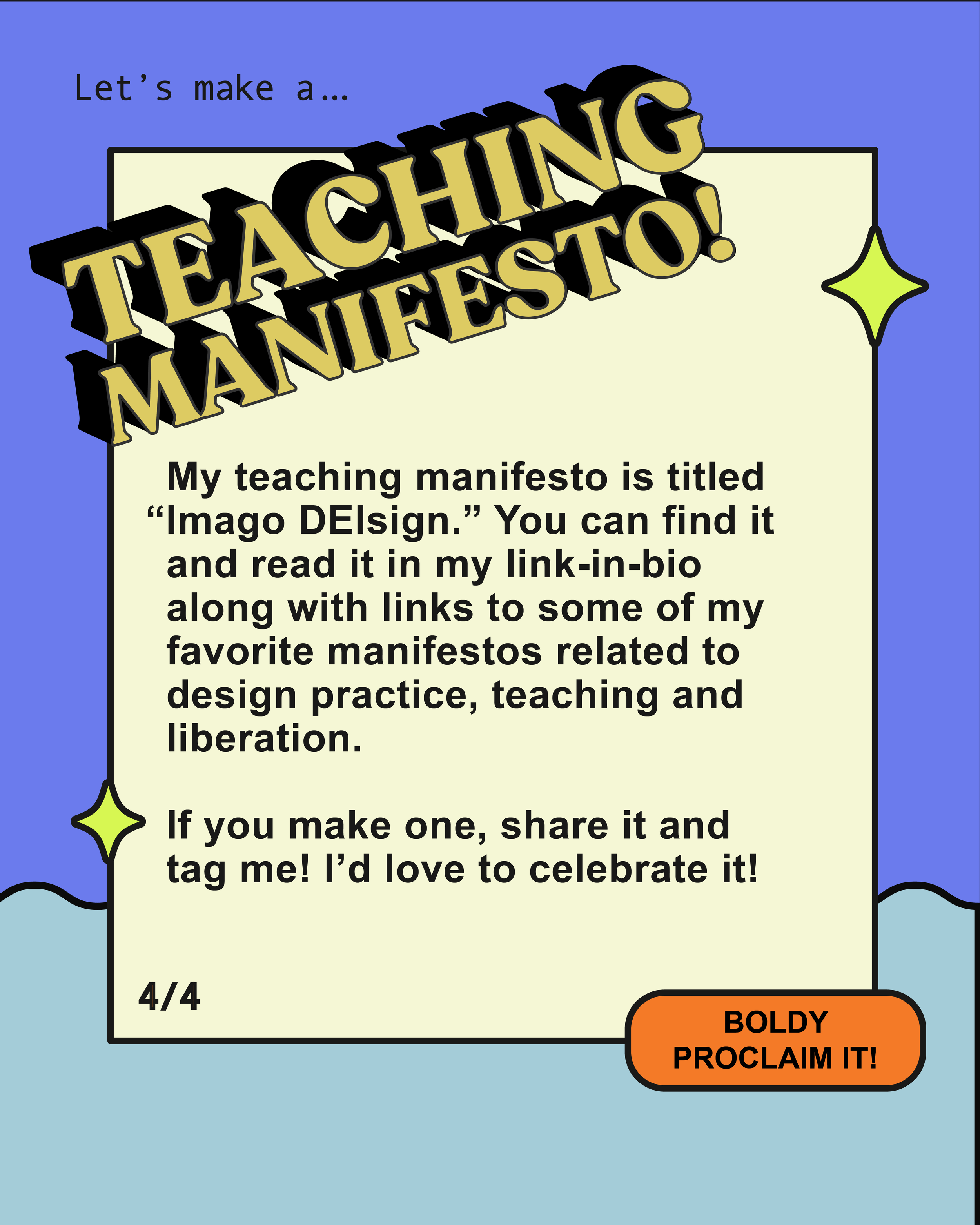
This month, I posted my Imago DEIsign Manifesto on Substack and promoted it on Instagram. The Instagram post sparked an idea: to create a Manifesto assignment within the Imago DEIsign framework for design practitioners. This assignment would encourage them to think intentionally about how they wish to apply the ideas I’m sharing. By framing my manifesto as a practice of intention rather than a prescriptive mandate, I hope to inspire others to craft their own unique path.
Generosity of Context
I moved my Ofrenda Oracle cards from sketch form into an INDD document with the goal of completing 20 cards, printing them, and presenting them at Winter PinUp. In my first feedback session, back in Winter ‘23 with David Schatz, remarked that much of the pinup work (student wide) lacked context. When he said my images lacked context, I agreed that context was missing for some viewers, but not for everyone. “If you grew up Latina, Catholic, and then discovered feminism, these images are rich with context.” At the same time, I also agreed that to reach an audience outside of that specific experience—my work would need a clever way to convey context and invite others in.
I’ve wrestled with this context challenge ever since. My primary audience is the comunidad, and I also want to share this work generously across intersections. But I’m cautious about being too accommodating and viewing the project through a white lens—making excessive concessions for those outside the experience and, in turn, risking isolation of the comunidad, my primary audience.
The Mickelane Thomas show really helped me think about how to use play and hospitality to deliver context.
The Ofrenda Oracle cards offer a thoughtful entry point into the symbols and meanings used in the altars, and are deeply rooted in the Chicana experience and Mexican/ American and / or Mesoamerican Histories. By pairing visual elements with a taste of context and a reflective prompt, the cards provide context that resonates with those from similar backgrounds while inviting broader audiences to understand and appreciate these cultural symbols, building a bridge toward deeper understanding.
Altars/ Ofrenda
The Garden
I began sharing my Altar/Ofrenda work as a tiled image on Instagram, using the format to post excerpts from the narrative essays, inspiration, and research that inform its creation. While this process is enjoyable, therapeutic, and liberating, it is also deeply personal, making the decision to share it publicly a vulnerable one—something I have intentionally avoided for at least five years for various reasons.
When I feel Chicken, I go back to a couple of touch points:
1) This is the kind of work I’ve needed to see at various stages in my life when I was struggling with a situation connected to various points of identity—and felt totally lonely in the journey to “figure it out.”
2) Seth Godin’s writing on the concept of generosity vs. hoarding of creative work; While it can seem prescriptive, what I have chosen to take away is that sharing can be beneficial without being self-sacrificing, or giving everything away. I’m mindful of striking a balance between those ideas.
3) Natalia Ilyin’s question during critique: What does sharing this work do? My answer was “I’m sending the boat back.” This was an answer I got from Gabriel Union’s memoir You got anything stronger?